“I was … trapped in a nightmare.”
When the Mighty Morphin Power Rangers freed Tommy Oliver from Rita Repulsa’s control, the prophecy was fulfilled and the Green Ranger, joined the side of good to defend the Earth. In one world. Once free in another, Tommy became something else entirely, Lord Drakkon. He ruled over a shattered world where only the Coinless stood against him. No longer a Power Ranger, Kimberly Hart continued fighting for her world, until she was manipulated by Lord Drakkon. Cursed with the Bow of Darkness, Kimberly became his tool. She became his Ranger Slayer. Her path has been full of darkness, but once a ranger always a ranger….
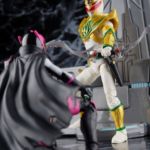
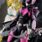
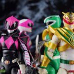
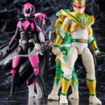
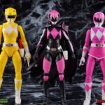
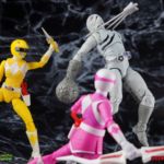
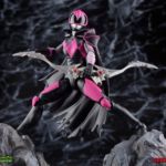
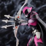
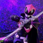
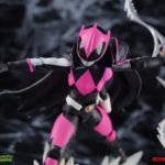
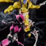
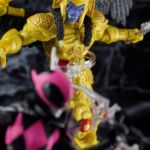
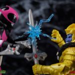
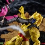
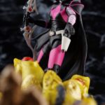
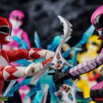
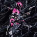
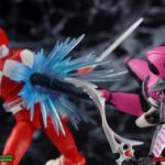
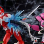
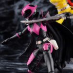
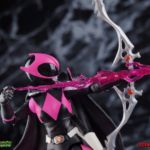
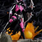
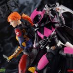
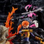
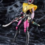
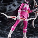
The Ranger Slayer joins the line as a part of Wave 5, along side the MMPR Blue Ranger, Time Force Red, and Trey of Triforia. Only the 2nd Boom! Studios inspired figure in the line, after Lord Drakkon, Ranger Slayer builds on the imperfect releases of the MMPR Pink & Yellow Rangers to give us our first really great female figure in the line. Armed with her own Blade Blaster, the Bow of Darkness, a triple shot arrow & arrow energy effect part, Ranger Slayer really is one of our favorite releases in the line thus far.
We’ve assembled over 50 images of the Lightning Collection Ranger Slayer for your viewing pleasure after the jump. Just click “Discuss on the TokuNation Forums” at the bottom of this post to be taken to the full gallery and review thread. Next time we’re returning to the world of the Oni Riders with a new gallery from Kamen Rider Hibiki!


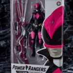
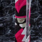
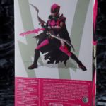
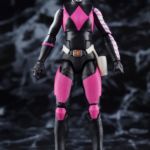
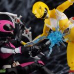
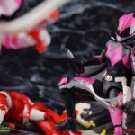
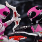
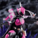

"It's enough to make a girl blush."
When the Mighty Morphin Power Rangers freed Tommy Oliver from Rita Repulsa's control, the prophecy was fulfilled and the Green Ranger, joined the side of good to defend the Earth. At least, in one world. Once free in another, Tommy became something else entirely, Lord Drakkon. He ruled over a shattered world where only the Coinless stood up to him. Kimberly Hart may not have been a Power Ranger anymore, but given the choice she would fight for her world, til the end. But bewitched by Lord Drakkon, cursed with the Bow of Darkness, Kimberly became a tool for this would be king. She became his Ranger Slayer. Kimberly's path has been dark and full of loss, but once a ranger, always a ranger. Coinless, beyond the grid, returning home. She has done terrible things she will always regret, but the power still protects. No longer bound by Drakkon's magic, can Kimberly bring peace to her world? Or will threats to come have other plans?
Packaging
As we are all pretty familiar with the line by now, I'm sure I probably don't need to go through my usual list of reasons why it's awesome. Hasbro was keen to make sure these appealed to collectors and fans of the franchise from throughout it's various eras. And they also really pop thanks in no small part to some wonderful box art, lovingly crafted by artist Tom Whalen aka @strongstufftom on twitter. His artwork is breathtaking, and makes these figure's feel like just a bit more of a passion project from the folks at Hasbro.
Main Figure
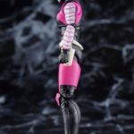
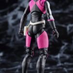
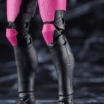
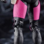
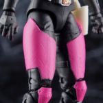
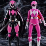
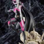
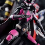
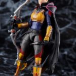
At a glance one would assume the Ranger Slayer is a reuse of the MMPR Pink Ranger mold, but on closer inspection and comparison of the two, this appears to be an entirely new sculpt outside either the Pink or Yellow Rangers. The classic boots are gone, replaced by solid legs that do not swivel below the knee. Instead we get feet and lower legs that feel more uniform and have some subtle sculpted leather/fabric folds, and there are raised armor parts coming into play on the knee and thigh pads. Ranger Slayer also features some really awesome suit weathering that I've yet to see on other figures in the line so far. Being that she comes from a pretty dismal future, one where she has fought hard and continues to fight again now in her new series, the weathering is very appropriate, much appreciated, and maybe easy to miss. While QC discrepancies happen from time to time, there's no question that this detail is intentional, though depending on how your Ranger Slayer is painted it may not look like that. On Kim's knee & thigh pads we have some sculpted in scuff marks and battle scars that evoke a pretty good representation of how her suit looks in a number of appearances in the Boom! comics.
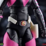
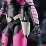
This figure also features a far more natural waist assembly than the Pink Ranger, largely thanks to there being no skirt involved in this design. Now this lower waist and mid torso section may be the same as the Yellow Ranger, they do look physically similar but I can't say that for certain. What I can say is that because this is a normal waist, we get normal dynamic hip movement out of the figure, which combined with the double jointed knees and swivel/hinge ankles gives us a great starting point for most posing. But around the waist of the figure are some more newly sculpted parts in the form of Ranger Slayer's Power Morpher. The core morpher itself appears to be mostly the same as the other Mighty Morphin Rangers, though the details are a bit hard to decipher at this scale. The Morpher is set in place on a black buckle across her waist, while an angular white belt wraps around her back and sides, evoking a far more sinister look than the traditional Power Morphers. One bit of parts reuse we do see is the Blade Blaster holster on the left hip, which can accommodate Ranger Slayer's own Dark Blade Blaster. Though officially I don't believe it has a unique name.
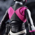
While the waist probably shares tooling with the Yellow Ranger, the upper body of this figure is very much a new part. There are only 3 feminine body figures in the Lightning Collection so far, this being the third (with Rita yet to release), and Ranger Slayer evokes an older Kimberly with a stockier build over all. Ultimately the range of articulation the upper body has is just as good if not better than the yellow ranger, and far exceeds what the limited Pink Ranger design could achieve. Being able to arch her fully forward & back and rotate the upper body gives you plenty of options.
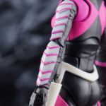
The arms are unfortunately executed in the same way as the others. The shoulders are the same butterfly style joint we've seen pretty much across the line. To accommodate the new upper body design the joints range and open areas are a bit different taking up a just slightly less real estate on the torso than Yellow Ranger. The actual shoulders are also a bit different than typical. They sit just a bit out further from the body but ratchet up and out in the same manner. The elbows are of the same variety as Pink/Yellow Ranger as well. Rather than the normal double joint hinge we've seen with the boys, Ranger Slayer continues the odd trend of having a fully rotating elbow on a peg. It's pegged into bicep with a single hinge joint to move it up. This means the elbow isn't double jointed or nearly as dynamic in a forward/back sense, but that it can rotate fully giving it some weird extra range. This is largely to make up for the lack of a bicep swivel. The wrists operate as usual, though you will undoubtedly notice the difference in the forearm sculpts. No MMPR gloves gives them a much smoother and proportional appearance, while the left arms has some spectacular sculpted and painted chevrons going all the way down it. This design is very reminiscent of the Pink Ranger as she appeared in Boom's Power Rangers Pink mini-series.
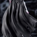
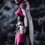
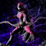
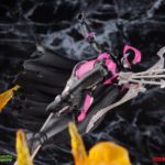
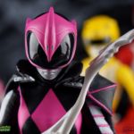
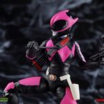
The Ranger Slayer does get one other new part that's uniquely her own, and that's her sweet sweet tattered cape. I'm a sucker for ratty looking capes on badass characters and this version of Kim has been absolutely rocking it from day one. For this figure it's removable, held on by friction around the neck. Should you choose to you can easily wrap it around the shoulders of any other compatible ranger, but it definitely looks best on her. Finally that brings us to the Ranger Slayer's helmet. Initially it does look a bit larger than the standard Pink Ranger helmet, but it really only appears that way because of the rather large visor, and the way the pink armor is shaped around the helmet. Overall I think it's a pretty strong sculpt, much better than what we got with the standard Pink Ranger, though it does feel a bit elongated? Minor gripes aside the entire design works very well in figure form and I'm quite pleased overall.
Accessories
2 - alternate hands. 1 Closed left fist, 1 karate chop style right hand.
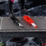
1 - Dark Blade Blaster. A simple black repaint of the Blade Blaster, this one really stands out in that it's only the 2nd time that the actual Blade has been released. This is a repaint of the weapon included exclusively (so far) in the SDCC Red & Gold Ranger 2-pack. Every other Mighty Morphin ranger that's been released thus far has only included the Blade Blaster in Blaster form, thus being inaccurate. I welcome the inclusion of a much more appropriate Blade this time though even if Ranger Slayer has rarely if ever used it.
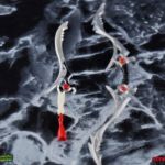
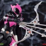
1 - Bow of Darkness. By far one of the coolest weapons in the line, and one of my favorite creations of the new Boom! continuity. The Bow of Darkness is a version of the Sword of Darkness that's been manipulated by Lord Drakkon into a weapon for his Ranger Slayer. The general sculpt is of course based on the Sword, though a bit stylized as well. It's just about the perfect approximate size & colors that it should be, though I worry about that black paint on the handle scraping over time. Above and below the grip there are also two small clips, which you can use to tab in the next accessory.
1 - Triple Arrow Shot. A really cool alternative to the singular arrow that came with the standard Pink Ranger, this triple shot can tab directly into the Bow of Darkness for steady posing.
1 - Arrow Energy Effect. This is a repack of the same effect part that came with the Pink Ranger, though cast in a darker shade of translucent pink. I still find this part to be a bit difficult to use, but it can be done.
The only real omission here, is an unmasked head. I know that Ranger Slayer really comes with a lot already, but she's now only the 2nd ranger in the line (after Magna Defender) to not include a civilian head. I'm not sure why that's what happened here, but I'd have gladly traded one of the arrow parts for an extra head. The Kimberly head included with the Pink Ranger will fit on sans the cape, but it does look rather disturbing with her expression.
Final Thoughts
The Ranger Slayer was a really excellent addition to the franchise from Boom! Studios series of Power Rangers comics. I've loved more or less everything that's been introduced in these series and this version of Kim ranks up there with some of the best additions to the mythos. The figure itself is likewise a fairly solid entry in the Lightning Collection toyline. While it may not be totally without flaws, it is an absolutely solid release with some excellent accessories. The Ranger Slayer is one of my favorite figures in the line thus far, and after reading Ranger Slayer #1, I dare say there are a few more related releases I'd love to see down the line.
Part 2
While I do wish she didn't have the twig arms that the other female figures do(and they sadly seem intent on keeping them if Space Yellow is anything to go by), at the very least the sculpted armor bits and the cape do hide that aspect somewhat. Overall though, I think she was done rather well. The sculpt is definitely there, and the few missing paint apps are ones I wouldn't consider super important(and I filled them in myself anyway), ontop of the great articulation that we typically get. Just wish they'd fix the necks and give us a stand waist twist or ball-joint. She's not my favorite figure in the line, but I overall felt that my favorite Pink Ranger was done justice.
Great pics as usual!
I don't get the love for the box art on the Lightning Collection? They're fairly generic, not all that amazing and spectacular like people say.
As someone who doesn't care too much for Lightning Collection, the boxes are really nice collected together and lined up.
It's a matter of opinion for sure, but I think they are far from generic. Generic would be a "template" style box with swappable elements for each character.
These boxes all use a full bleed print graphic, different cutouts for the window, and they thankfully removed any "marketing copy" like a bullet list of features or call-outs to other products/things.
I really need to read the comics
I think Hasbro boxes like Lightning Collection, X-men movie boxes, and the current GI Joe line are superior to their Marvel Legends. Marvel legends in general feels generic.
It feels generic because it looks like everything is made to be stuffed inside the box even if it shouldn't. The end result is I have no problem tossing the box.
These new boxes make use of the space and it feels calculated. Like care went into how the product is displayed inside. Then there some nice art on the side and back.
Lighting Collection, as said you have this artistic interpretation of the character. You can line the boxes up and have this nice cover span of half faces. You can display it at an angle and get a full face display. Then the box typically has a nice render of the figure(which is it's own discussion about false advertising).
Those other lines have something similar or better. You want to hold onto the box. It feels a bit premium as it's similar in design to a SHFiguarts or Mafex box.
Of course I've seen some much better boxes that do more(say NECA's) but it's a far cry from the packaging of those callback boxes. I LOATHE these Empire strike back and retro spider-man packaging. It reminds my why I like the new style more.
I also hate the current Marvel Legends box and wish they'd just phase it out and move to the clean box design.
Damn, this was a nice one to see, could have sworn it was an exclusive or something, though that might be me thinking of how Bandai would have handled this lol
Can't complain, really nice design.
Keep reading: Power Rangers Lightning Collection Ranger Slayer Gallery - Page 2
Not a member yet? Join TokuNation Now!